 Corporate identity is essential to the development of a brand—it becomes the overall image of the business/ corporation/ firm, which directly connects customers, employees and investors to you.

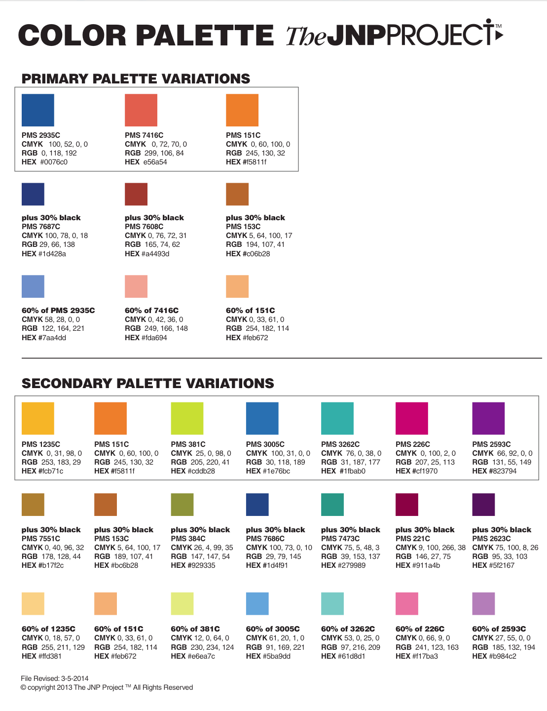
COLOR PALETTES are an essential anchor tying together your visual recognition image. I have worked on several extremely huge corporate identity projects whereas that responsibility was to solidify the overall corporate brand across the board (as corporate director of graphic design overseeing all of the properties of the Sands Casino Corporation and Hollywood Casinos); from your main logo identifier, to any subsequent logo/graphic icon identifiers, developing a primary and secondary color palette (Pantone® Matching System–PMS Colors) to work from gives you strength in your unified, visual appearance, for all iconic images developed.
“Process and procedures” would require the logo to have specific featured colors (specific PMS colors), and then a “brand color palette” of several colors that would represent alternate additional logo designs, type font colors for headings and colors for sub-headings—all this is the beginning of creating the visual color portion of your corporate identity package.
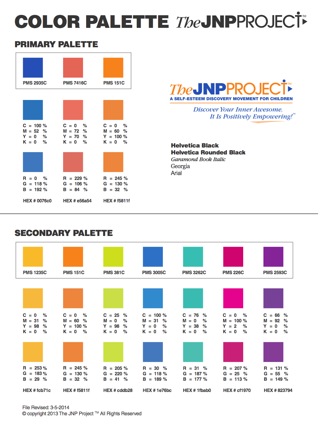
The JNP Project needed to have fun, engaging colors that I initially liked, but most importantly, would be pleasing and memorable to our customer. We choose BLUE (for its appeal to the water–where Oracle and all his sea-creature friends lived in Awesome) and ORANGE, the bright and fun color of our favorite pet fish, Oracle.
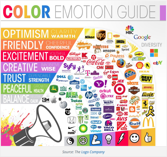
Typically, in most color emotion guides, BLUE has a feeling of trust, strength and dependability, and ORANGE feels friendly, cheerful and confident—all of which we want our JNP customers to feel when they engage in our brand!
A perfect example is when you explore this website—take notice of the color palette consistency throughout all our visual icons and type fonts.
Join Jane, Jake and all their friends on the adventures to discover your inner awesome, together!
~ ~ ~
Note: This Blog is a chronological diary of a start-up-company—The JNP Project’s Journey—reading it from the start, will broaden your understanding of the path we are on, together, and hopefully, positively influence you in some way!
FYI Tip: Color is vital to “who you are.” Make it count.
Also, for additional color branding information, review blogs:
#33: CHARACTER COLOR PALETTES
#34: RAND COLOR PALETTE EXTENDED
http://mashable.com/2013/06/09/color-schemes-business/
https://www.helpscout.net/blog/psychology-of-color/


No comments yet.