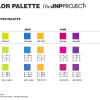
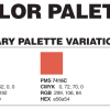
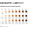
Our philosophy was to keep this palette neutral in tones so we could add to [exterior] facial and body skin with our “canvas texture,” which would then deepen the opportunity to utilize the exterior imagery as a ‘blank canvas’ ready for each child to express how they may feel and see the characters.
Tag Archives | children’s illustrtion
#33: CHARACTER COLOR PALETTES
COLOR PALETTES are an essential anchor tying together your visual recognition image—every color elicits a different response (or feeling) from your viewer.
#32: BRAND COLOR PALETTES
Screen Shot 2014-06-27 at 3.53.19 PM Typically, in most color emotion guides, BLUE has a feeling of trust, strength and dependability, and ORANGE feels friendly, cheerful and confident—all of which we want our JNP customers to feel when they engage in our brand!
#30: Character Development: JAUNTY [the go-to-guy]
Solving problems is one of the quickest ways to gain influence. When you solve problems for people, or resolve a difficult situation another person is facing, you gain trust, confidence and loyalty. You become a “go-to person”—that’s who Jaunty is to Oracle (Jane’s talking pet goldfish, who takes Jane and Jake on adventures to discover […]
#29: Character Development — JAKE
The World of Jane Not Plain, Jane & Jake’s Adventures to Awesome, began with Jane and Oracle… and along came Jane’s TRUE-BLUE FRIEND, JAKE! When we went out for the initial Phase One market testing, we began Jane NOT Plain with just Jane, and the intent was to focus on girl’s esteem. Real-time research (in […]
#26: Character Development — JANE (Not Plain)
The World of Jane Not Plain, Jane & Jake’s Adventures to Awesome, began with Jane and Oracle (her not-so-plain talking goldfish and best friend).