Choosing the ‘style’ of your website is directed by the amenities you need, want, desire, and can actually handle.
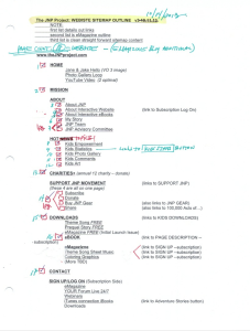 The JNP site needed to be interactive on many levels. First I began with my list of desired amenities for the site:
– Ability to edit 24/7
• editing to be done by myself and a Team member
– Editing process simple and accurate
• small learning-curve for anybody I put on the assignment
– E-commerce via pay-pal and credit card
• sale of books, songs, resource kits and merchandise
– Private subscription – fee paid—service side
• customer access to free downloads, a private Q&A Forum and more.
– Analytic tracking options
• plug in analytics—Google Analytics for sure
 – Live Forums
• Jane & Jake (key characters in the stories) talk to kids directly
– Blog ability
• real-time Founder’s Forum—to tell the JNP Journey
– Live social media feed
• social media real-time
– Responsive
• site reformat content/design to any/all digital devices
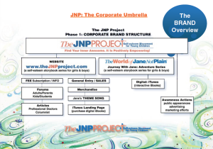
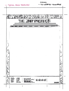
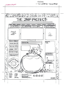
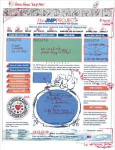
Being in the design industry gave me the upper hand, as I have designed and orchestrated websites in the past. I have a website guru that I am very confident in, and work well with; therefore, I began the project with my list of wants, and supplied my sitemap outline (typed in the hierarchy of priority of design). I also created a few template sketches as a beginning baseline: 1) for a basic page frame, and 2) the home page design and column format for the rest of the site. We took a home page sketch and uploaded it to see how it would look on an iPad–not bad to start!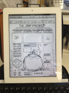
We began to layout the pages and templates in a beta site (live only to those that had the url).This was shared with the Creative Team, and the Advisory Committee on many, many meetings and development stages. Everyone gave feedback, and the first round of the site was completed.
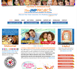 After several months of development, and growth to the content of the site, the site became overwhelming and not clear on its navigation, and confusing to who our potential customer was viewing it; therefore, we took 5 steps back to go 1 ahead, and redesigned the home page, and added three new landing pages to speak to each of our market: KIDS, PARENTS, and EDUCATORS. The site was definitely on a better navigation layout. With all this back and forth adding pages, on page 91 the site CRASHED—we lost 8 hours of design and coding time, and went back to adding content and design from memory. It took another few weeks, and we got all back together again. Even though we had a scheduled back up in place daily and weekly, it was just at the wrong point when the crash happened. Our web guru made sure all themes and plug-ins were not conflicting, and our backup and server host is all copacetic and working in sync now.
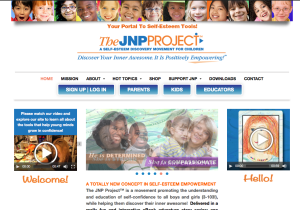 Stay tuned to see the site continue to grow, evolve and develop as JNP does!
~ ~ ~
Note: This Blog is a chronological diary of a start-up-company—The JNP Project’s Journey—reading it from the start, will broaden your understanding of the path we are on, together, and hopefully, positively influence you in some way!
FYI Tip: Should you make your own Word Press site? These posts are right on target with pro vs. con:
http://www.kitsmedia.ca/wordpress/should-you-make-your-own-wordpress-site/
http://www.figcreative.co.uk/blog/web/pros-and-cons-of-a-wordpress-website/




No comments yet.